Scouts Canada Web Redesign
Scouts Canada
Web Redesign
Scouts Canada Web Redesign
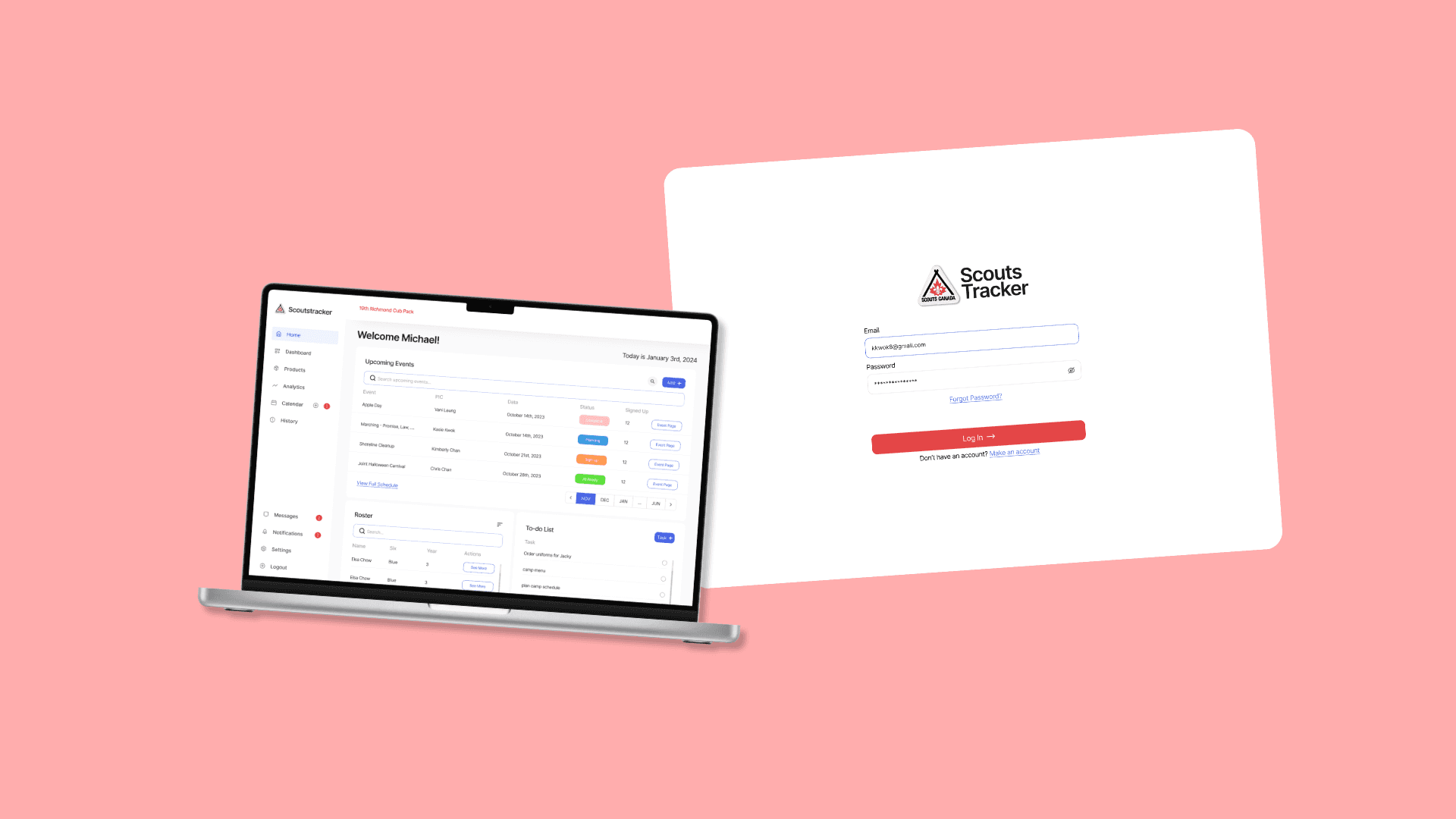
This project focuses on redesigning Scouts Canada's ScoutsTracker web application. We will revamp the platform based on our research findings, addressing key usability, aesthetic, and functional issues that users currently face. By taking these factors into account, we aim to create a more intuitive and visually appealing experience for ScoutsTracker users.
This project focuses on redesigning Scouts Canada's ScoutsTracker web application. We will revamp the platform based on our research findings, addressing key usability, aesthetic, and functional issues that users currently face. By taking these factors into account, we aim to create a more intuitive and visually appealing experience for ScoutsTracker users.
Project Type
Project Type
Project
Type
School Project
My Role
My Role
UX Designer
Interviewer
UX Designer, Interviewer
Team
Team
Cici Tan(myself)
Chris Chan
Jeremy Yan
Leann Ngong
Cici Tan(myself) , Chris Chan, Jeremy Yan, Leann Ngong
Tool
Tool
Figma/Figjam
Zoom
Figma/Figjam, Zoom
Timeline
6 weeks, October, 2023
Challenge
The current system for managing Scouts is chaotic, largely due to poor communication and a lack of standardized processes. Decisions made by higher-level leaders are often not effectively communicated to all members, creating confusion. Leaders must plan events early to ensure attendance and keep parents informed, but they currently rely on four different applications to manage their sections, making the process inefficient and time-consuming. Our challenge is to streamline these operations into a single, cohesive platform that improves communication, simplifies event planning, and enhances the overall user experience for both leaders and parents.
Goal
Redesigning the internal system aimed to address key usability challenges by simplifying the navigation structure, enabling staff and volunteers to quickly access essential features like user management, event scheduling, and resource allocation. The information architecture and task flows were streamlined to improve operational efficiency, reducing time spent on routine tasks. Additionally, cross-device compatibility was enhanced to ensure seamless performance on desktops, laptops, and mobile devices. Lastly, the visual design was modernized to create a more intuitive, user-friendly interface that enhances the overall work experience and satisfaction of internal users.
Redesigning the internal system aimed to address key usability challenges by simplifying the navigation structure, enabling staff and volunteers to quickly access essential features like user management, event scheduling, and resource allocation. The information architecture and task flows were streamlined to improve operational efficiency, reducing time spent on routine tasks. Additionally, cross-device compatibility was enhanced to ensure seamless performance on desktops, laptops, and mobile devices. Lastly, the visual design was modernized to create a more intuitive, user-friendly interface that enhances the overall work experience and satisfaction of internal users.
Redesigning the internal system aimed to address key usability challenges by simplifying the navigation structure, enabling staff and volunteers to quickly access essential features like user management, event scheduling, and resource allocation. The information architecture and task flows were streamlined to improve operational efficiency, reducing time spent on routine tasks. Additionally, cross-device compatibility was enhanced to ensure seamless performance on desktops, laptops, and mobile devices. Lastly, the visual design was modernized to create a more intuitive, user-friendly interface that enhances the overall work experience and satisfaction of internal users.
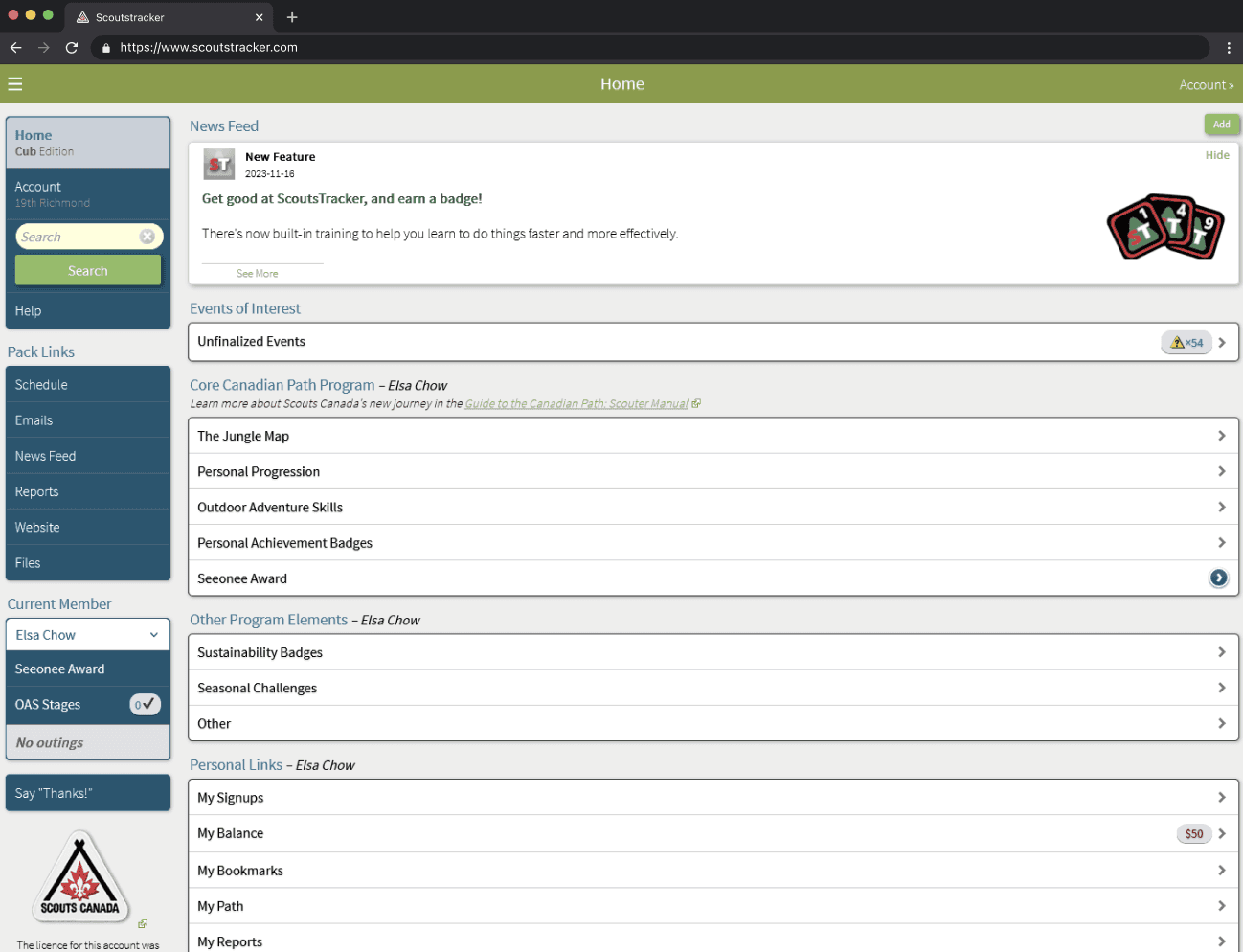
ScoutsTracker existing home page
ScoutsTracker existing home page
ScoutsTracker existing home page
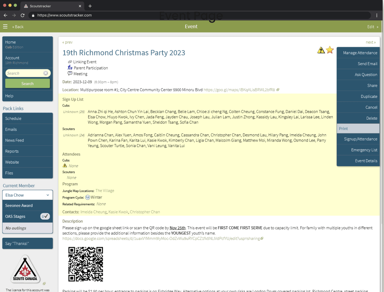
ScoutsTracker existing event page
ScoutsTracker existing event page
ScoutsTracker existing event page






Overall Review
Interview Survey, and Co-Creation Workshop
Our design team interviewed Scouts leaders to understand their system usage, pain points, and areas for improvement, ensuring the insights would guide key design decisions.
What do you use Scoutstracker for?
What are your main issues with it?
Take us through a task you would do
We surveyed Scouts leaders to gather further insights into their experiences and challenges with ScoutsTracker. The survey focused on key questions
What problems are you currently facing?
What is the most frustrating part about this task?
What would you like to change about this product?
We recruited two volunteer leaders from each of Scouts Canada’s three program age groups. Participants planned an event, reflecting on past challenges. In a usability test, they evaluated the home and event pages, sharing what they found essential and unnecessary. These insights pinpointed critical areas for redesign.
Interview, Survey, and Co-Creation Workshop
Step 1: Our design team conducted interviews with Scouts leaders better to understand their experiences and pain points with the platform.
What do you use Scoutstracker for?
What are your main issues with it?
Take us through a task you would do
Step 2: We surveyed leaders to gather additional insights into their experiences and challenges with the ScoutsTracker.
What problems are you currently facing?
What is the most frustrating part about this task?
What would you like to change about this product?
Step 3: Scouts Canada runs programs for three age groups, and we recruited two volunteer leaders from each for our study. Leaders spent five minutes planning an event, reflecting on past challenges. We then conducted a usability test where participants evaluated the home page, sharing what they would like to see and what they felt was unnecessary. This helped us pinpoint key areas for improvement.
Competitive Analysis
During my interactions with participants, I discovered that many also used multiple other online ordering platforms. I identified the most frequently used apps and researched their common benefits to understand what makes them appealing to users. This helped inform our approach to improving the user experience in our app.
After reviewing the interviews, surveys, and workshops, we identified 4 key insights that guided our design process.
Their current process does work
Not all processes require redesign—preserving workflows that function well minimizes disruption. Our approach focused on optimizing pain points while keeping existing strengths intact.Ease of use is important
Solutions must be intuitive, reducing cognitive load to ensure users can easily navigate and complete tasks without unnecessary friction.Everyone wishes Scoutstracker was easy
Users expressed a desire for task streamlining, emphasizing that reducing complexity and time spent on core operations is crucial to improving engagement and efficiency.There needs to be less needed communication
The current planning process involves excessive manual coordination. Implementing a centralized platform for real-time progress tracking and updates would enhance collaboration efficiency and reduce communication bottlenecks
Interview, Survey, and Co-Creation Workshop
Step 1: Our design team conducted interviews with Scouts leaders better to understand their experiences and pain points with the platform.
What do you use Scoutstracker for?
What are your main issues with it?
Take us through a task you would do
Step 2: We surveyed leaders to gather additional insights into their experiences and challenges with the ScoutsTracker.
What problems are you currently facing?
What is the most frustrating part about this task?
What would you like to change about this product?
Step 3: Scouts Canada runs programs for three age groups, and we recruited two volunteer leaders from each for our study. Leaders spent five minutes planning an event, reflecting on past challenges. We then conducted a usability test where participants evaluated the home page, sharing what they would like to see and what they felt was unnecessary. This helped us pinpoint key areas for improvement.
Visuals Are Essential for User Motivation
High-quality food images significantly enhance user engagement. The absence of visuals reduces users' interest and their likelihood of completing an order.A Streamlined, Uncluttered Interface Is Crucial
A clean, focused interface improves usability. Overly complex or crowded layouts hinder users’ ability to find key actions, reducing overall satisfaction.
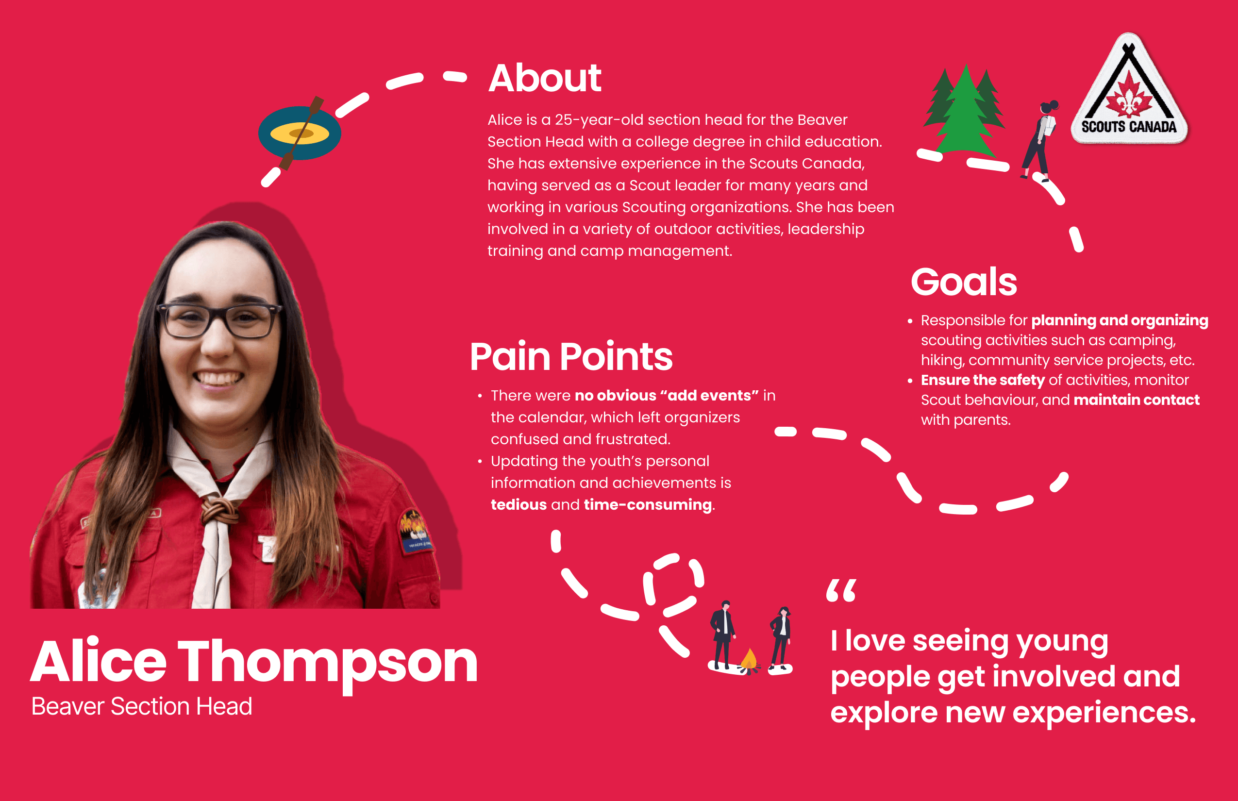
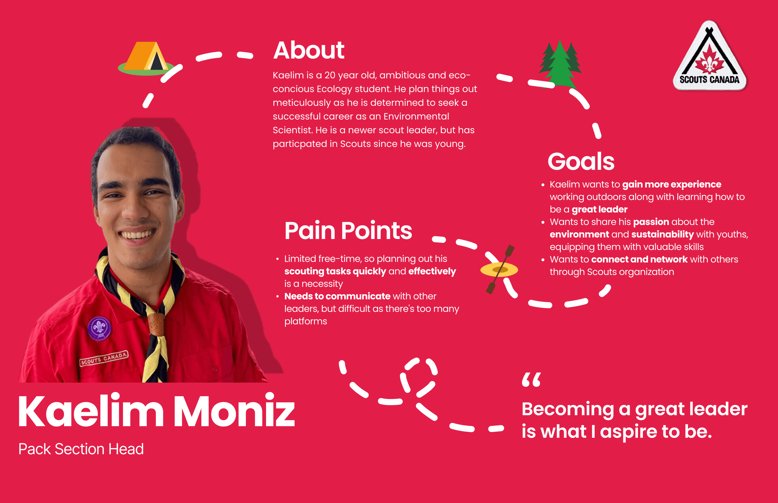
Based on user interviews, I created two personas to highlight the distinct needs that the final design must address. These personas serve as a foundation for ensuring the design effectively meets user expectations.
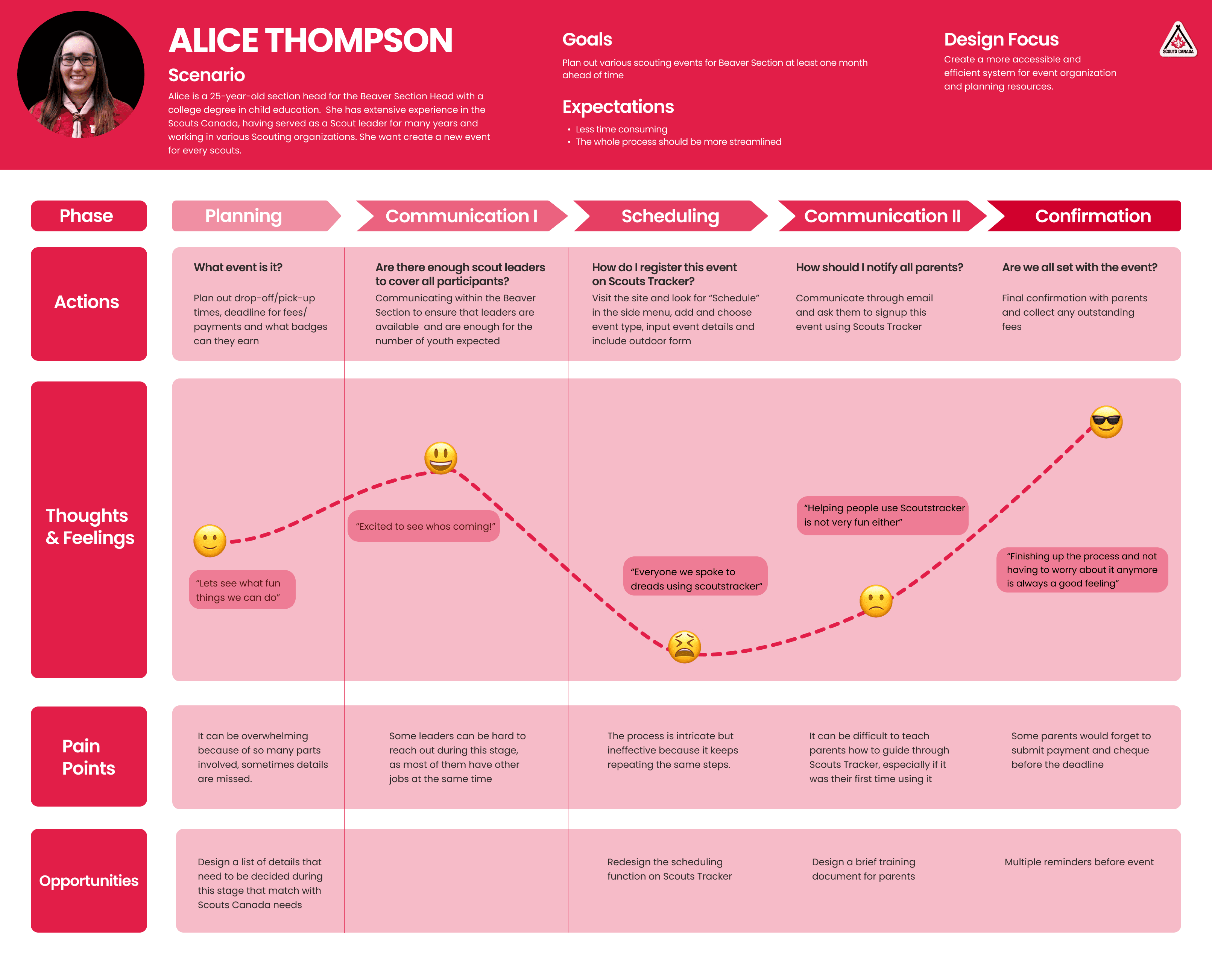
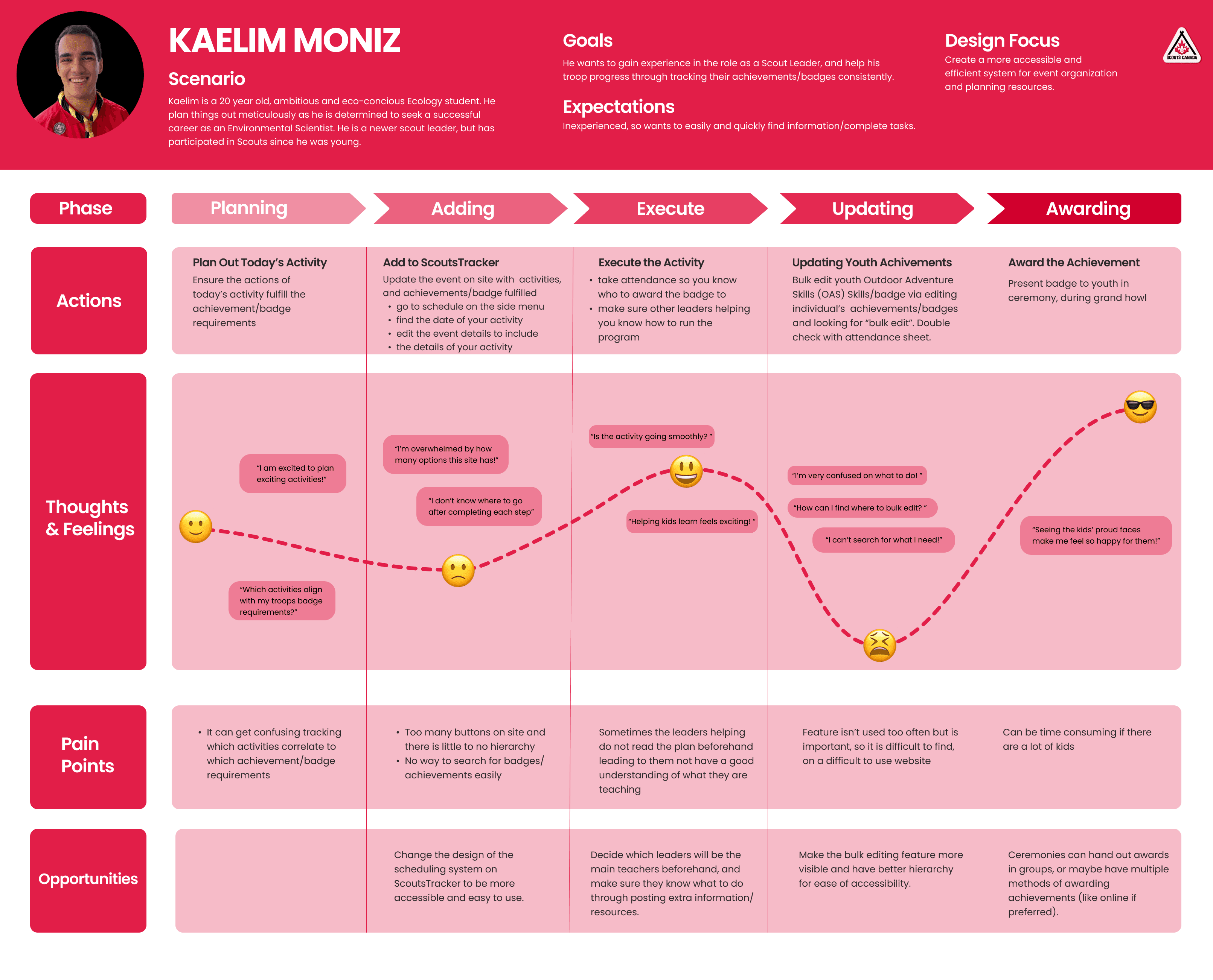
Our team also developed two user journeys based on the personas we created, along with insights from interviews, surveys, and workshops. These user journeys helped us better identify user pain points and improve overall usability in the design process.
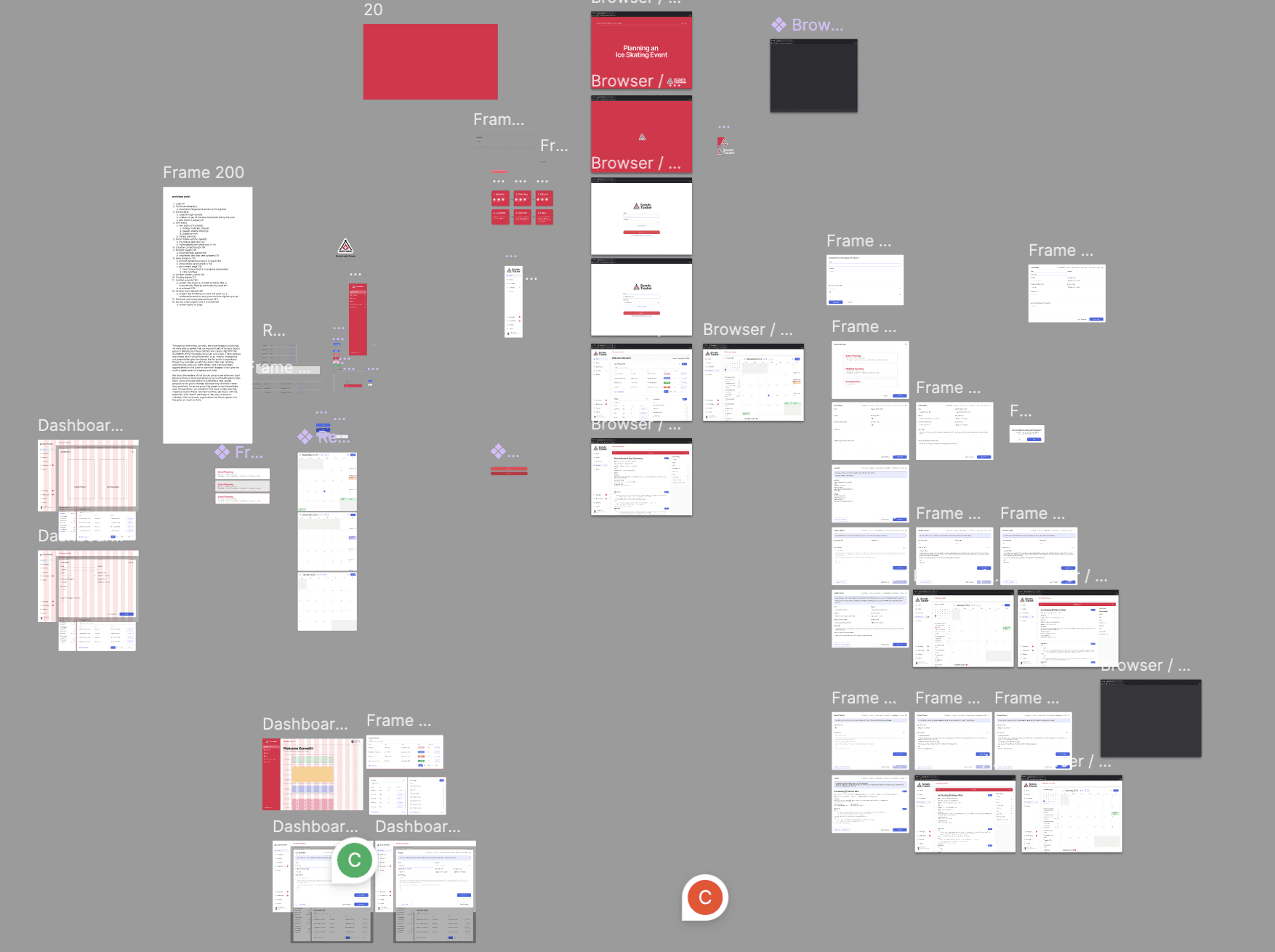
Our team developed a more comprehensive set of user experience flows for the high-fidelity prototypes, divided into 4 stages. Our refined design focus involves moving all planning activities onto a redesigned Scoutstracker platform. This approach allows leaders to be guided through the planning process while keeping other leaders and parents informed of any updates, reducing the manual communication burden on volunteers.
Maintain existing processes without unnecessary changes
Enhance ease of use
Minimize cognitive load
Simplify updates for other leaders
We conducted quick usability testing with a few Scouts leaders, asking them to navigate the prototype and plan a skating event.
What went well
Helpful for new leaders
New leaders will find the process much more manageable, as they receive step-by-step guidance throughout. This support ensures they can confidently navigate and complete tasks without feeling overwhelmed.
Improved home dashboard
The updated information on the home page is significantly more helpful, providing users with quick access to relevant updates and streamlining their overall experience.
Being able to save your progress
It reduces the need for manual tracking, alleviating overhead and allowing users to manage details more efficiently and with less effort.
What could be better
Clarity of calendar items
Users expressed a desire for more detailed information to be directly accessible on the calendar for each event, allowing them to quickly view and manage event details without additional navigation.
Ability to customize home page
It may be useful for each leader if they are able to customize the home page.
I thoroughly enjoyed collaborating with Scouts Canada on this project. It was my first experience redesigning an entire website, and I gained valuable insights into the unique aspects of web design compared to app design. This project deepened my understanding of how to approach user experience and interface design for different platforms.
User needs must be a primary focus during client/user testing. After conducting a role-playing workshop with Scouts leaders, we received valuable feedback highlighting its effectiveness. The role play provided deep insights and revealed interesting observations for both our team and the participants. Each of the initial three activities seamlessly flowed into one another, creating a structured and engaging process that fostered participant engagement and buy-in.
Time management is crucial. In the latter half of our workshop, poor time management led to a rushed experience, which prevented users from fully engaging in the activities. This highlighted the importance of maintaining a well-structured schedule to ensure participants have enough time to contribute meaningfully and gain value from the session.
Attention to detail is key to success. Throughout the design process, I discovered that attention to detail can significantly reduce user errors and confusion. This not only improves the efficiency of user interactions but also enhances information delivery. By providing a more intuitive and structured experience, users can quickly find the information they need, ultimately improving overall communication and usability.
After reviewing the interviews, surveys, and workshops, we identified 4 key insights that guided our design process.
Their current process does work
We recognized that not all processes need to be changed—if something is working well, there's no need to disrupt it. Our focus is on improving areas that truly need enhancement without altering what's already effective.Ease of use is important
Any solution we propose must be simple and intuitive, with a focus on reducing cognitive load to ensure a seamless user experience.Everyone wishes Scoutstracker was easy
High-quality food images significantly enhance user engagement. The absence of visuals reduces users' interest and their likelihood of completing an order.There needs to be less needed communication
Currently, each step of planning requires communication with others. It would be ideal to have a centralized place to track progress and updates in real-time.
Visuals Are Essential for User Motivation
High-quality food images significantly enhance user engagement. The absence of visuals reduces users' interest and their likelihood of completing an order.A Streamlined, Uncluttered Interface Is Crucial
A clean, focused interface improves usability. Overly complex or crowded layouts hinder users’ ability to find key actions, reducing overall satisfaction.
Based on user interviews, I created two personas to highlight the distinct needs that the final design must address. These personas serve as a foundation for ensuring the design effectively meets user expectations.Visuals Are Essential for User Motivation
High-quality food images significantly enhance user engagement. The absence of visuals reduces users' interest and their likelihood of completing an order.
A Streamlined, Uncluttered Interface Is Crucial
A clean, focused interface improves usability. Overly complex or crowded layouts hinder users’ ability to find key actions, reducing overall satisfaction.
Our team also developed two user journeys based on the personas we created, along with insights from interviews, surveys, and workshops. These user journeys helped us better identify user pain points and improve overall usability in the design process.Visuals Are Essential for User Motivation
High-quality food images significantly enhance user engagement. The absence of visuals reduces users' interest and their likelihood of completing an order.
A Streamlined, Uncluttered Interface Is Crucial
A clean, focused interface improves usability. Overly complex or crowded layouts hinder users’ ability to find key actions, reducing overall satisfaction.
Our team developed a more comprehensive set of user experience flows for the high-fidelity prototypes, divided into 4 stages. Our refined design focus involves moving all planning activities onto a redesigned Scoutstracker platform. This approach allows leaders to be guided through the planning process while keeping other leaders and parents informed of any updates, reducing the manual communication burden on volunteers.
Maintain existing processes without unnecessary changes
Enhance ease of use
Minimize cognitive load
Simplify updates for other leadersVisuals Are Essential for User Motivation
High-quality food images significantly enhance user engagement. The absence of visuals reduces users' interest and their likelihood of completing an order.
A Streamlined, Uncluttered Interface Is Crucial
A clean, focused interface improves usability. Overly complex or crowded layouts hinder users’ ability to find key actions, reducing overall satisfaction.
We conducted quick usability testing with a few Scouts leaders, asking them to navigate the prototype and plan a skating event.
What went well
Helpful for new leaders
New leaders will find the process much more manageable, as they receive step-by-step guidance throughout. This support ensures they can confidently navigate and complete tasks without feeling overwhelmed.
Improved home dashboard
The updated information on the home page is significantly more helpful, providing users with quick access to relevant updates and streamlining their overall experience.
Being able to save your progress
It reduces the need for manual tracking, alleviating overhead and allowing users to manage details more efficiently and with less effort.
What could be better
Clarity of calendar items
Users expressed a desire for more detailed information to be directly accessible on the calendar for each event, allowing them to quickly view and manage event details without additional navigation.
Ability to customize home page
It may be useful for each leader if they are able to customize the home page.
Visuals Are Essential for User Motivation
High-quality food images significantly enhance user engagement. The absence of visuals reduces users' interest and their likelihood of completing an order.
A Streamlined, Uncluttered Interface Is Crucial
A clean, focused interface improves usability. Overly complex or crowded layouts hinder users’ ability to find key actions, reducing overall satisfaction.
I thoroughly enjoyed collaborating with Scouts Canada on this project. It was my first experience redesigning an entire website, and I gained valuable insights into the unique aspects of web design compared to app design. This project deepened my understanding of how to approach user experience and interface design for different platforms.
User needs must be a primary focus during client/user testing. After conducting a role-playing workshop with Scouts leaders, we received valuable feedback highlighting its effectiveness. The role play provided deep insights and revealed interesting observations for both our team and the participants. Each of the initial three activities seamlessly flowed into one another, creating a structured and engaging process that fostered participant engagement and buy-in.
Time management is crucial. In the latter half of our workshop, poor time management led to a rushed experience, which prevented users from fully engaging in the activities. This highlighted the importance of maintaining a well-structured schedule to ensure participants have enough time to contribute meaningfully and gain value from the session.
Attention to detail is key to success. Throughout the design process, I discovered that attention to detail can significantly reduce user errors and confusion. This not only improves the efficiency of user interactions but also enhances information delivery. By providing a more intuitive and structured experience, users can quickly find the information they need, ultimately improving overall communication and usability.
Visuals Are Essential for User Motivation
High-quality food images significantly enhance user engagement. The absence of visuals reduces users' interest and their likelihood of completing an order.
A Streamlined, Uncluttered Interface Is Crucial
A clean, focused interface improves usability. Overly complex or crowded layouts hinder users’ ability to find key actions, reducing overall satisfaction.
Process
Final Design
Client Feedback
Conclusion+ Reflection
4 Key Insights
User Persona
User Jouney
High-fidelity prototype & Usability Test
User Persona
User Journey
High-fidelity prototype & Usability Test
Process
Event info
Search
Add event
Each leader can easily view detailed event information, such as time, participant numbers, and other specifics, ensuring clarity and efficient event management.
Each leader can easily view detailed event information, such as time, attendance, and other key details.
Leaders can easily add event details directly to the ScoutsTracker calendar and send email notifications to those who need the information, ensuring smooth coordination and timely communication.
Each leader can easily view detailed event information, such as time, attendance, and other key details.


