Bubble Waffle Redesign
This project aimed to improve the user experience of the Bubble Waffle app by addressing usability issues identified through usability testing and heuristic evaluation. Our goal was to simplify the online ordering process, enhance the interface, and introduce features that facilitate seamless navigation, customization, and transactions. These improvements were designed to meet user expectations, ultimately boosting engagement and satisfaction.
This project aimed to improve the user experience of the Bubble Waffle app by addressing usability issues identified through usability testing and heuristic evaluation. Our goal was to simplify the online ordering process, enhance the interface, and introduce features that facilitate seamless navigation, customization, and transactions. These improvements were designed to meet user expectations, ultimately boosting engagement and satisfaction.
This project aimed to improve the user experience of the Bubble Waffle app by addressing usability issues identified through usability testing and heuristic evaluation. Our goal was to simplify the online ordering process, enhance the interface, and introduce features that facilitate seamless navigation, customization, and transactions. These improvements were designed to meet user expectations, ultimately boosting engagement and satisfaction.
Project Type
Project Type
School Project
School Project
School Project
My Role
My Role
UX Researcher
UX/UI Designer
Team
Cici Tan(Myself)
Harvey Li
Tool
Tool
Figma
Google Survey
Figma
Google Survey
Figma
Google Survey
Timeline
Timeline
3 weeks, February 2023
3 weeks, February 2023
3 weeks, February 2023
Challenge
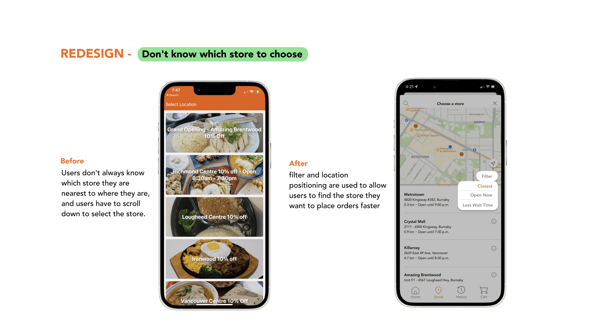
The existing app interface is cluttered, making menu navigation and order placement unnecessarily complex. These challenges significantly reduce engagement for both new and returning users. Furthermore, the lack of personalization and customization options limits the app’s appeal and usability. Our objective was to resolve these issues by enhancing the user experience, streamlining task flows, and encouraging users to choose the Bubble Waffle app over third-party platforms.
Result
Through user interviews, surveys, and usability testing, we identified key pain points and improvement opportunities. These insights guided us to streamline workflows, enhance navigation, and optimize key interactions, resulting in a more intuitive interface that improved both usability and user satisfaction.
20
Accepted an interview
10
Tested new interface
9/10
Task Successful Rate
Process
Process
Process
Usability Research& Usability Test Round 1
Step 1:We recruited 20 participants who frequently use online ordering and in-store pickup services to complete a survey, gathering insights on their preferences and pain points.
Step 2: From the survey group, we selected 10 participants for anonymous interviews and usability testing to further explore user challenges and behaviors.
These methods allowed us to identify key pain points and gain a deeper understanding of user needs, providing a foundation for the redesign
Competitive Analysis
Through discussions with participants, I learned that many regularly used multiple online ordering platforms. I analyzed the most frequently mentioned apps to identify common benefits and features that enhance user experience. This research guided our approach to improving the app’s usability by incorporating successful patterns from other platforms.
Usability Research& Usability Test Round 1
My partner and I recruited 20 participants who frequently use online ordering and in-store pickup to complete a survey.
Additionally, we selected 10 participants from step 1 for anonymous interviews and usability testing.
These methods allowed us to identify key pain points and better understand user needs within the existing app.
Competitive Analysis
During my interactions with participants, I discovered that many also used multiple other online ordering platforms. I identified the most frequently used apps and researched their common benefits to understand what makes them appealing to users. This helped inform our approach to improving the user experience in our app.
Usability Research& Usability Test Round 1
Step 1:We recruited 20 participants who frequently use online ordering and in-store pickup services to complete a survey, gathering insights on their preferences and pain points.
Step 2: From the survey group, we selected 10 participants for anonymous interviews and usability testing to further explore user challenges and behaviors.
These methods allowed us to identify key pain points and gain a deeper understanding of user needs, providing a foundation for the redesign
Competitive Analysis
Through discussions with participants, I learned that many regularly used multiple online ordering platforms. I analyzed the most frequently mentioned apps to identify common benefits and features that enhance user experience. This research guided our approach to improving the app’s usability by incorporating successful patterns from other platforms.


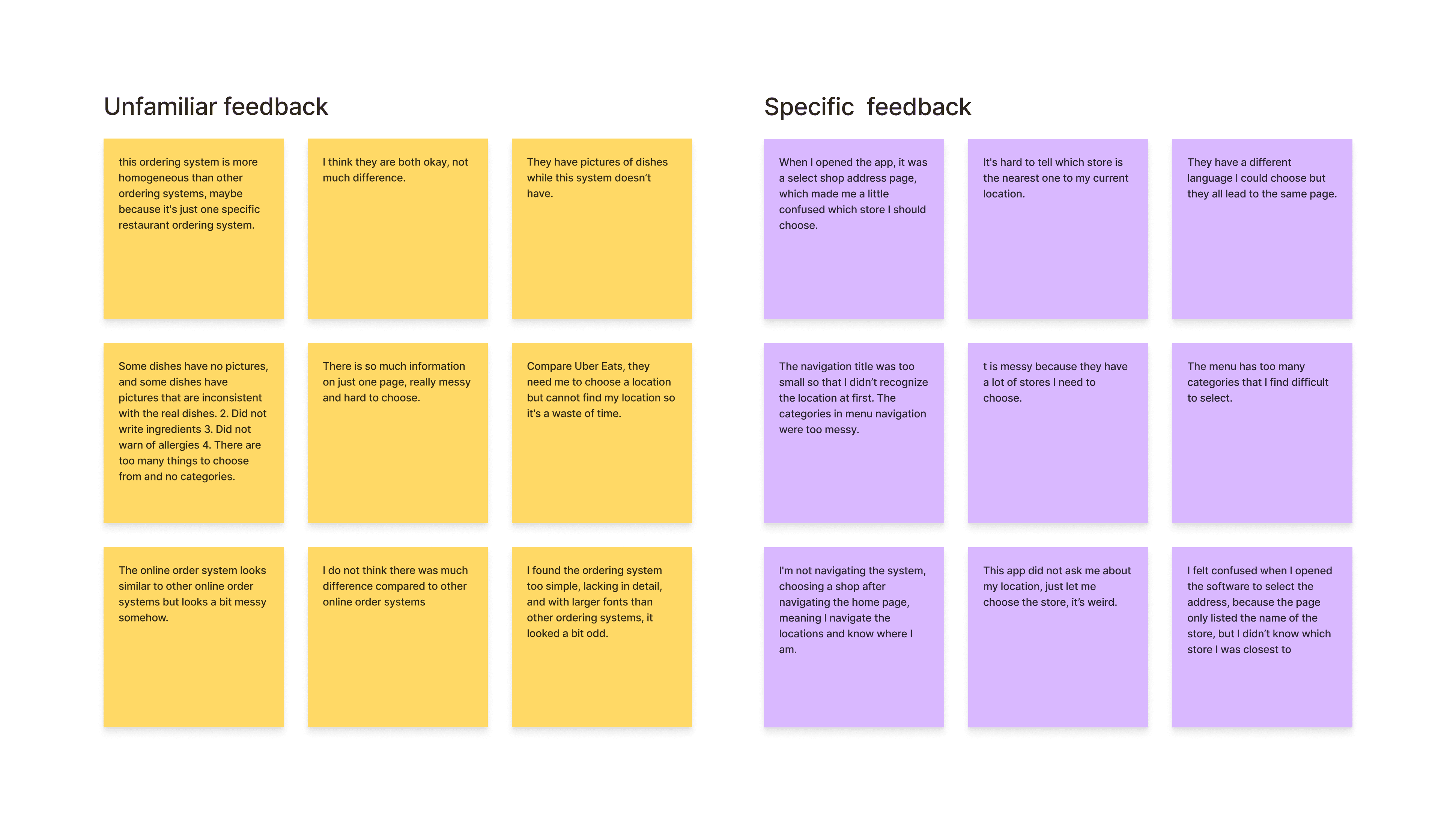
Affinity Map
After conducting the interviews and usability tests, we organized the notes and grouped similar insights into four distinct categories. This process helped us better understand user requirements across various aspects of the app, allowing us to address their needs in the redesign better.
Key Insight
After reviewing the interview and usability test and dividing it into four different themes, I come up with 4 key insights👇
Information Overload Slows Down the Experience
Excessive details during the ordering process overwhelm users, disrupting their ability to navigate smoothly and complete tasks efficiently.Familiar Fonts and Interfaces Drive Engagement
Users are more likely to engage with interfaces that utilize familiar fonts, layouts, and design conventions, as these elements foster trust and ease of use.Visuals Are Essential for User Motivation
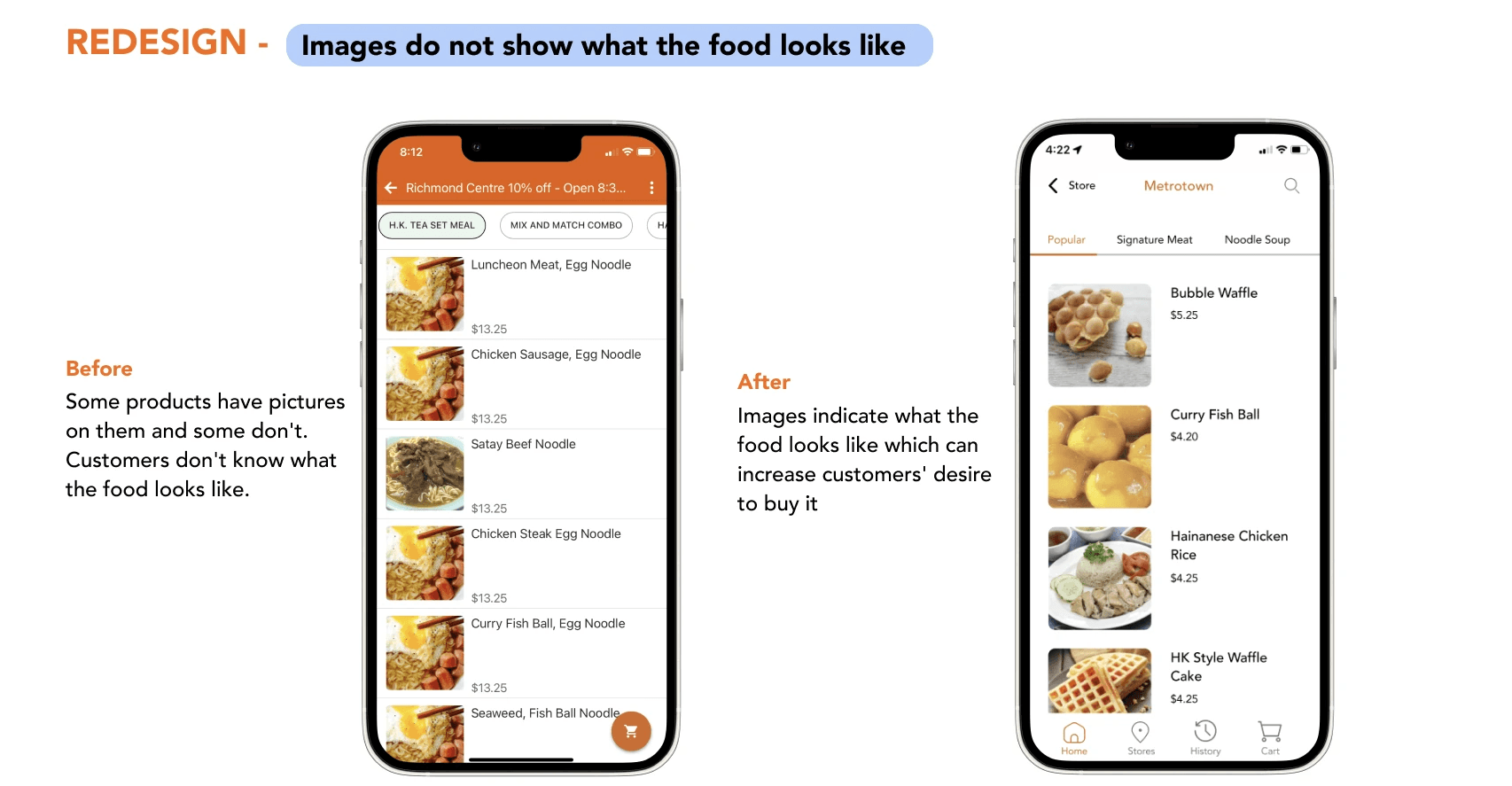
High-quality food images significantly boost user engagement by creating visual appeal. A lack of visuals reduces users' interest and decreases the likelihood of order completion.A Streamlined, Uncluttered Interface Is Crucial
A clean, focused interface improves usability. Overly complex or crowded layouts hinder users’ ability to find key actions, reducing overall satisfaction.
Key Insight
After reviewing the interview and usability test and dividing it into four different themes, I come up with 4 key insights👇
Information Overload Slows Down the Experience
Excessive details in the ordering process overwhelm users, making it difficult for them to navigate and complete their tasks efficiently.Familiar Fonts and Interfaces Drive Engagement
Users are more inclined to engage with interfaces that feature familiar typography and design patterns, creating a sense of trust and ease.Visuals Are Essential for User Motivation
High-quality food images significantly enhance user engagement. The absence of visuals reduces users' interest and their likelihood of completing an order.A Streamlined, Uncluttered Interface Is Crucial
A clean, focused interface improves usability. Overly complex or crowded layouts hinder users’ ability to find key actions, reducing overall satisfaction.Visuals Are Essential for User Motivation
High-quality food images significantly enhance user engagement. The absence of visuals reduces users' interest and their likelihood of completing an order.A Streamlined, Uncluttered Interface Is Crucial
A clean, focused interface improves usability. Overly complex or crowded layouts hinder users’ ability to find key actions, reducing overall satisfaction.
Key Insight
After reviewing the interview and usability test and dividing it into four different themes, I come up with 4 key insights👇
Information Overload Slows Down the Experience
Excessive details during the ordering process overwhelm users, disrupting their ability to navigate smoothly and complete tasks efficiently.Familiar Fonts and Interfaces Drive Engagement
Users are more likely to engage with interfaces that utilize familiar fonts, layouts, and design conventions, as these elements foster trust and ease of use.Visuals Are Essential for User Motivation
High-quality food images significantly boost user engagement by creating visual appeal. A lack of visuals reduces users' interest and decreases the likelihood of order completion.A Streamlined, Uncluttered Interface Is Crucial
A clean, focused interface improves usability. Overly complex or crowded layouts hinder users’ ability to find key actions, reducing overall satisfaction.
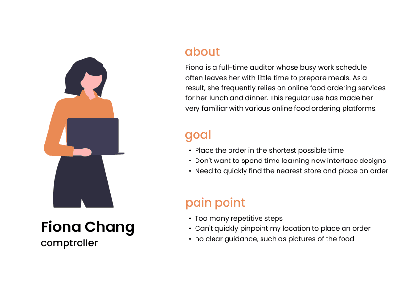
User Persona
Our team conducted extensive user research, including surveys and interviews, to gather key insights. These findings informed the creation of a detailed persona, which served as a strategic guide throughout the design process, ensuring that our solutions were user-centered and aligned with real-world requirements.
User flow
After completing user research and usability testing, my team and I redesigned the user flow to better align with user behavior and expectations. Our goal was to streamline the user journey, improving the overall app experience and making navigation more intuitive and efficient.


Delivery

Initial Design and Wireframe
After completing the user flow, I quickly created a low-fidelity sketch to evaluate the feasibility of the design solution.
High-Fidelity Design
After creating the low-fidelity wireframe, my team and I developed a medium-fidelity prototype to conduct the second round of usability testing, allowing us to refine and validate our design further.
Key Insight
After reviewing the interview and usability test and dividing it into four different themes, I come up with 4 key insights👇
Information Overload Slows Down the Experience
Excessive details in the ordering process overwhelm users, making it difficult for them to navigate and complete their tasks efficiently.Familiar Fonts and Interfaces Drive Engagement
Users are more inclined to engage with interfaces that feature familiar typography and design patterns, creating a sense of trust and ease.Visuals Are Essential for User Motivation
High-quality food images significantly enhance user engagement. The absence of visuals reduces users' interest and their likelihood of completing an order.A Streamlined, Uncluttered Interface Is Crucial
A clean, focused interface improves usability. Overly complex or crowded layouts hinder users’ ability to find key actions, reducing overall satisfaction.Visuals Are Essential for User Motivation
High-quality food images significantly enhance user engagement. The absence of visuals reduces users' interest and their likelihood of completing an order.A Streamlined, Uncluttered Interface Is Crucial
A clean, focused interface improves usability. Overly complex or crowded layouts hinder users’ ability to find key actions, reducing overall satisfaction.
User Persona
Our team conducted comprehensive user research, including surveys and interviews, to gather valuable insights. This data allowed us to craft a detailed persona that serves as a foundational guide for our design process, ensuring our solutions are tailored to real user needs and behaviors.
User flow
After completing user research and usability testing, my team and I redesigned the user flow to better align with user behavior and expectations. Our goal was to streamline the user journey, improving the overall app experience and making navigation more intuitive and efficient.
Delivery
Initial Design and Wireframe
After completing the user flow, I quickly created a low-fidelity sketch to evaluate the feasibility of the design solution.

High-Fidelity Design
AAfter creating the low-fidelity wireframe, my team and I developed a medium-fidelity prototype to conduct the second round of usability testing, allowing us to refine and validate our design further.
Usability Testing Round2
In this round of usability testing, we used the same tasks as in the previous test to assess whether the new prototype effectively addressed user needs.
Task 1: Explore the new Bubble Waffle Café online ordering system for 5 minutes, using the Think Aloud technique to share your thoughts while browsing.
Task 2: Imagine you're at home and need to leave in 2 minutes. You want to quickly place an order from the Bubble Waffle Café online system for pick-up. Order a chocolate-flavored bubble waffle and a large lemon tea with no sugar and less ice.
This approach helped us observe how well the updated prototype supported common user scenarios and decision-making processes.
Visuals Are Essential for User Motivation
High-quality food images significantly enhance user engagement. The absence of visuals reduces users' interest and their likelihood of completing an order.A Streamlined, Uncluttered Interface Is Crucial
A clean, focused interface improves usability. Overly complex or crowded layouts hinder users’ ability to find key actions, reducing overall satisfaction.
Major Improvement
Based on feedback from 10 participants, we made key design adjustments following the second round of usability testing to address user pain points and improve the overall experience.


High-Fidelity Prototype
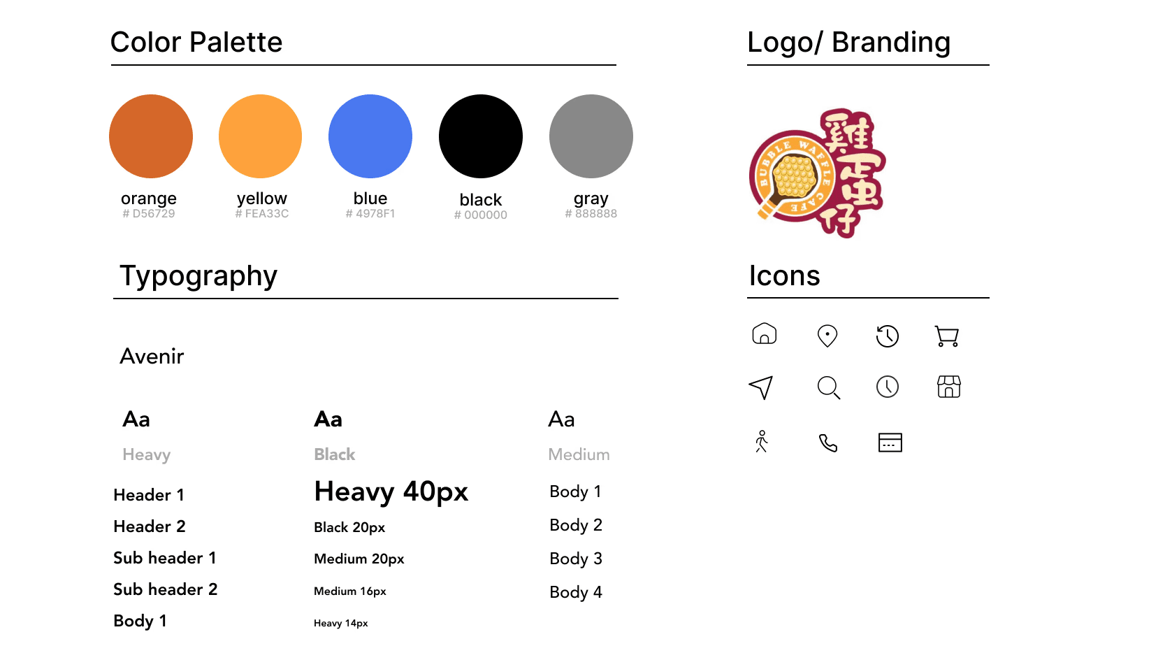
Style Guide
Style Guide
For this case study, I maintained the original app design style while introducing new icons to enhance the user experience.
This was my first UX project with a real-world brand, and I’m incredibly grateful for the opportunity to work on it. I gained valuable insights from my teammate, professor, and TA throughout the process:
1. Gather comprehensive user insights. Our team conducted expert reviews before moving into usability and think-aloud testing. Initially, we identified what we thought were key user pain points, but after completing user surveys, we discovered that the actual pain points were quite different. Thoroughly understanding user pain points is essential to effectively addressing their needs.
2. Usability testing is essential. Each round of usability testing allowed us to identify flaws in the current iteration and provided deeper insights into why users offered certain feedback or suggestions. This was crucial in refining our design.
3. Crafting unbiased questions is critical. When preparing surveys, interviews, and tasks, it’s important to maintain neutrality in the phrasing. A designer’s or interviewer’s wording can unintentionally influence participant responses, leading to biased results. Thoughtful question design is key to gathering accurate user insights.
This project helped me grow as a UX designer and provided a strong foundation for future projects.
Delivery
Initial Design and Wireframe
After completing the user flow, I quickly created a low-fidelity sketch to evaluate the feasibility of the design solution.
Initial Design and Wireframe
After completing the user flow, I quickly created a low-fidelity sketch to evaluate the feasibility of the design solution.
High-Fidelity Design
After creating the low-fidelity wireframe, my team and I developed a medium-fidelity prototype to conduct the second round of usability testing, allowing us to refine and validate our design further.
High-Fidelity Design
After creating the low-fidelity wireframe, my team and I developed a medium-fidelity prototype to conduct the second round of usability testing, allowing us to refine and validate our design further.
Usability Testing Round 2
In this round of usability testing, we repeated the same tasks from the previous session to evaluate whether the updated prototype effectively met user needs.
Task 1: Explore the new Bubble Waffle Café online ordering system for 5 minutes. Using the Think Aloud method, share your thoughts and reactions as you navigate the interface.
Task 2: Imagine you're at home with only 2 minutes before leaving. Quickly place an order for a chocolate-flavored bubble waffle and a large lemon tea (no sugar, less ice) through the online system.
This approach enabled us to observe how the prototype handled common user scenarios, including decision-making speed and task efficiency. These insights helped validate the design improvements and further refine key interactions.
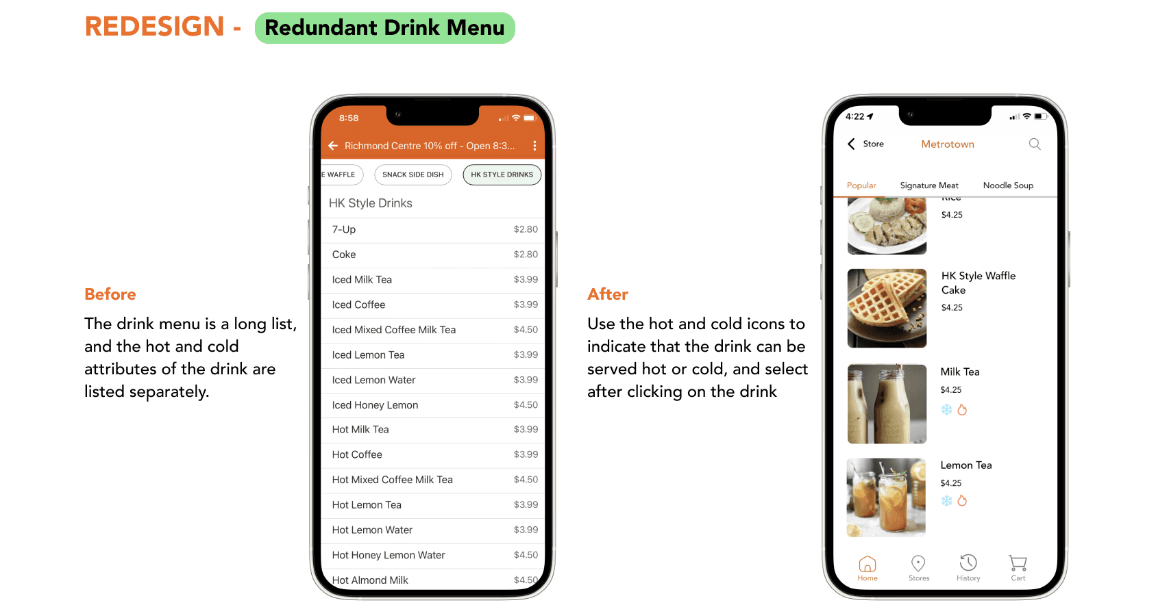
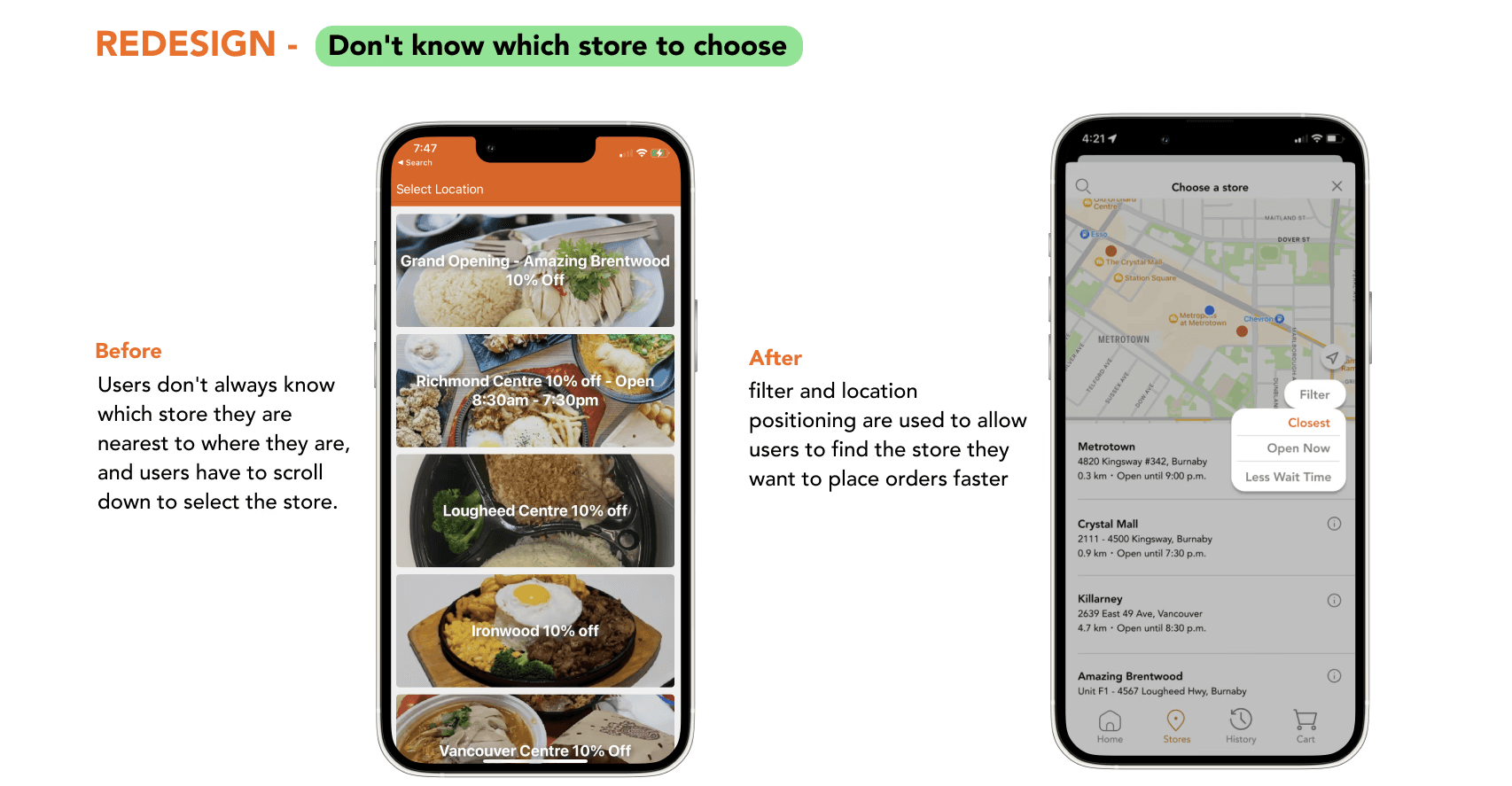
Menu page
Menu page
Landing page
Landing page
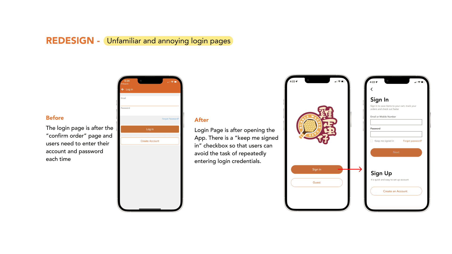
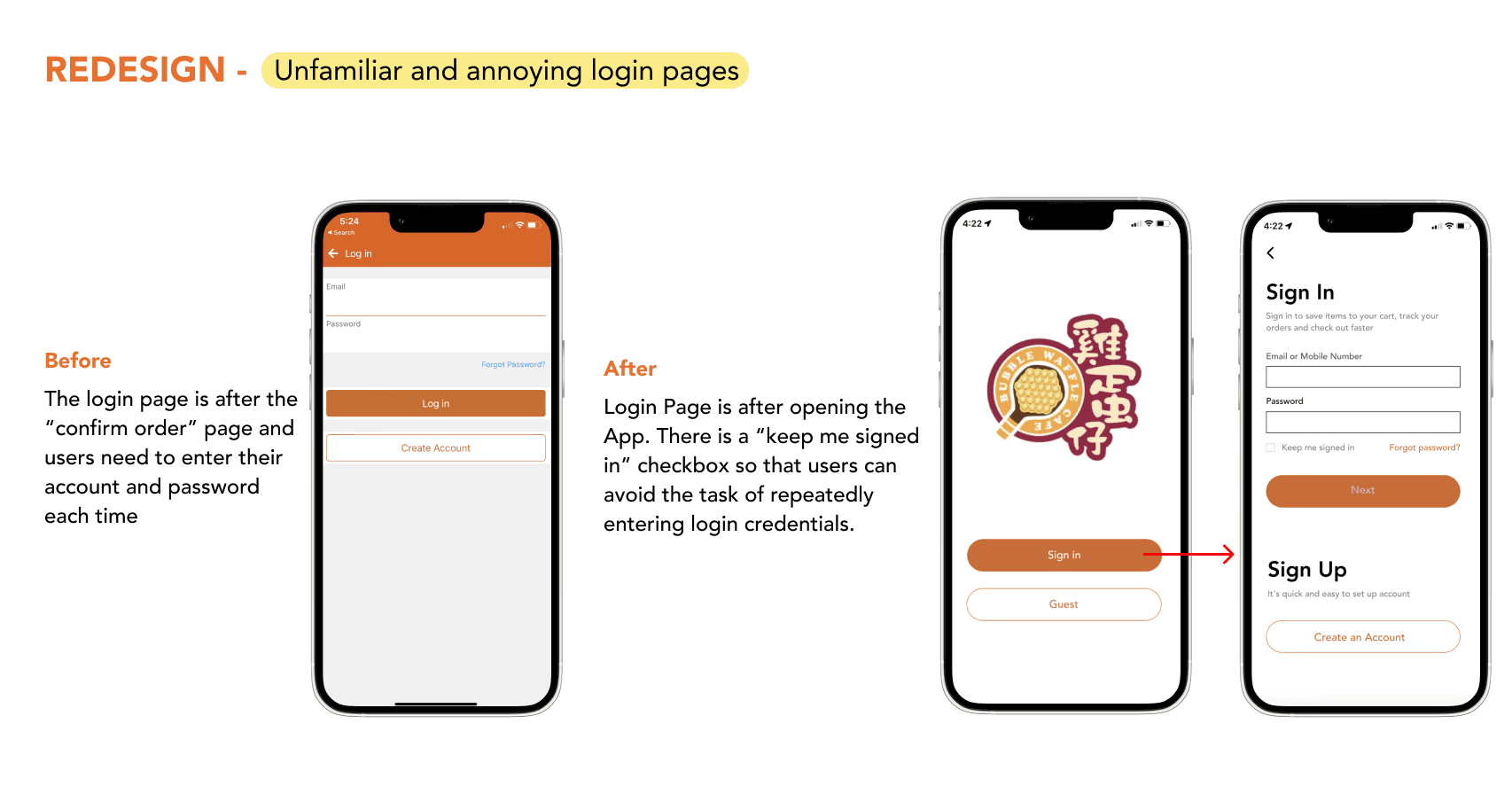
Login page
Login page
Food page
Food page
Major Improvment
Based on feedback from 10 participants, we made key design adjustments following the second round of usability testing to address user pain points and improve the overall experience.
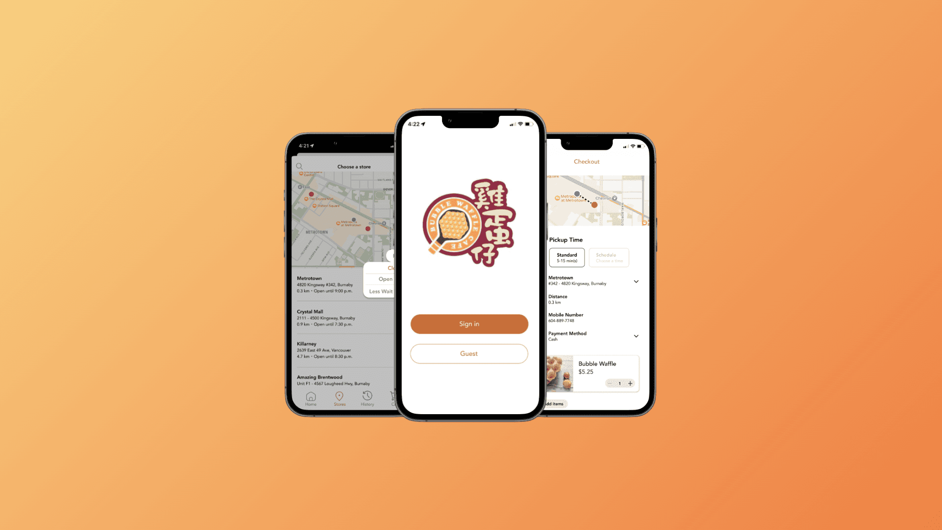
High-Fidelity Prototype
Check out the final prototype video below! 👇
Style Guide
For this case study, I maintained the original app design style while introducing new icons to enhance the user experience.
Conclusion+ Refelction
This was my first UX project with a real-world brand, and I’m incredibly grateful for the opportunity to work on it. I gained valuable insights from my teammate, professor, and TA throughout the process:
1. Gather comprehensive user insights. Our team conducted expert reviews before moving into usability and think-aloud testing. Initially, we identified what we thought were key user pain points, but after completing user surveys, we discovered that the actual pain points were quite different. Thoroughly understanding user pain points is essential to effectively addressing their needs.
2. Usability testing is essential. Each round of usability testing allowed us to identify flaws in the current iteration and provided deeper insights into why users offered certain feedback or suggestions. This was crucial in refining our design.
3. Crafting unbiased questions is critical. When preparing surveys, interviews, and tasks, it’s important to maintain neutrality in the phrasing. A designer’s or interviewer’s wording can unintentionally influence participant responses, leading to biased results. Thoughtful question design is key to gathering accurate user insights.
This project helped me grow as a UX designer and provided a strong foundation for future projects.