Get Started
School project
My Role
UX/UI Designer
UX Researcher
Cici Tan(myself)
Joey Liu
Shun Guo
Figma
Prototype
Timeline
5 weeks, April 2022
Challenge
Due to the global pandemic, many people have transitioned to working from home or hybrid models. However, factories still require extensive monitoring systems to detect abnormalities in warehouse environments. Workers need a platform that allows them to monitor and adjust warehouse conditions online. Most existing software only supports one-way data management and lacks the ability to facilitate effective communication between managers and employees. The challenge is to create a user-friendly solution that enables seamless communication and allows workers to manage warehouse conditions more efficiently in a remote setting.
Goal
This app is designed to facilitate remote collaboration between managers and employees, specifically focusing on warehouse environmental management. Managers use the app to assign tasks and remotely monitor warehouse conditions, while employees receive tasks and report their progress in real-time, ensuring seamless communication and operational efficiency.
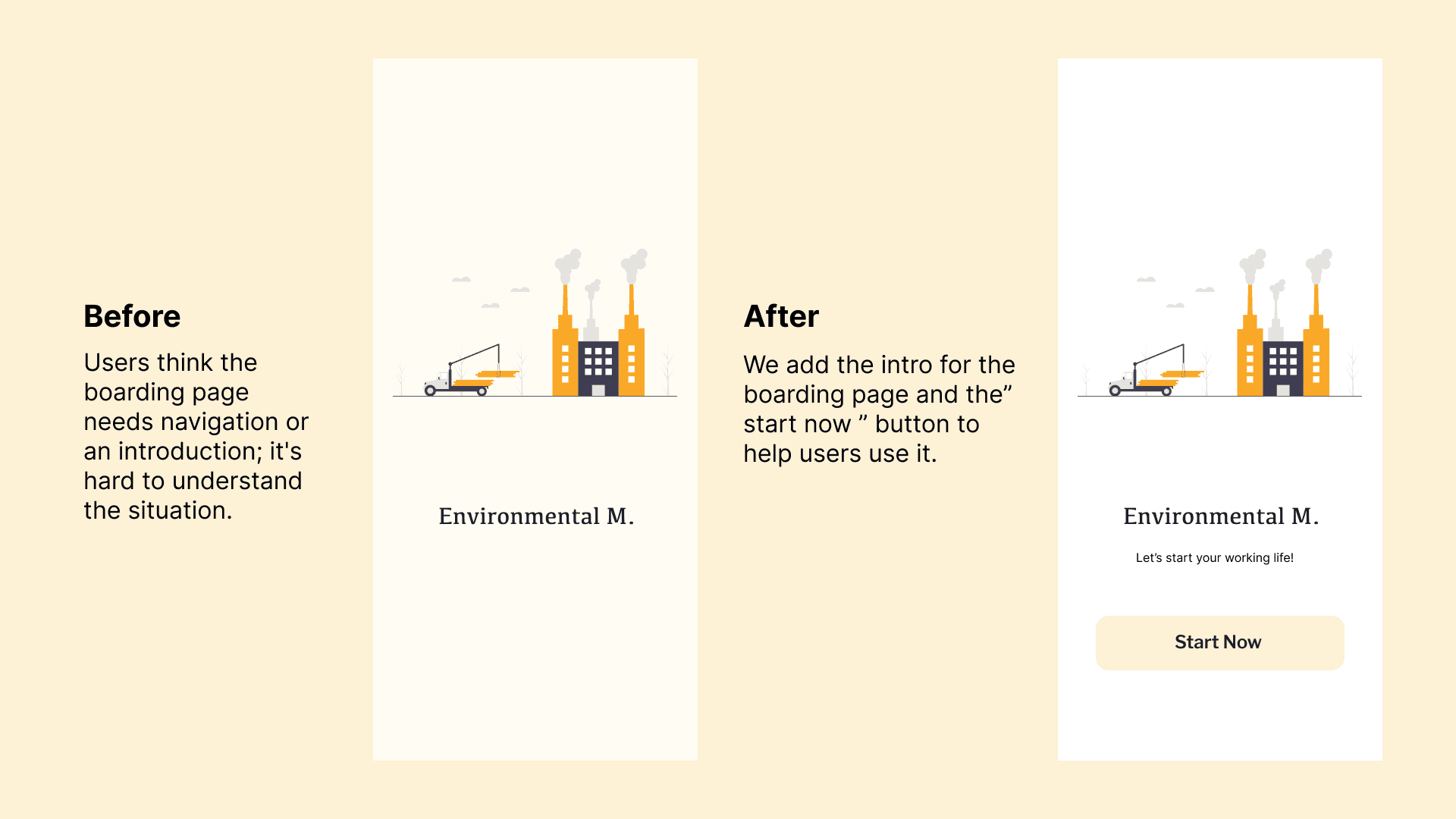
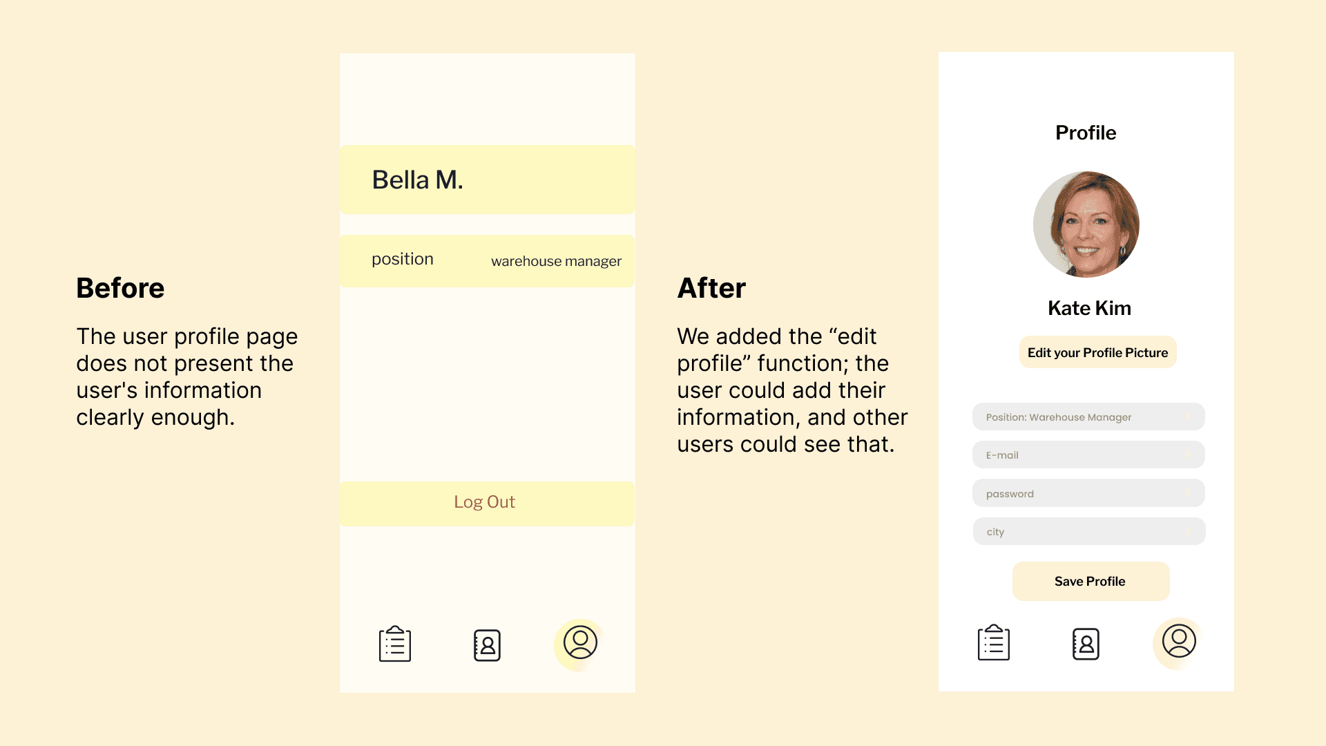
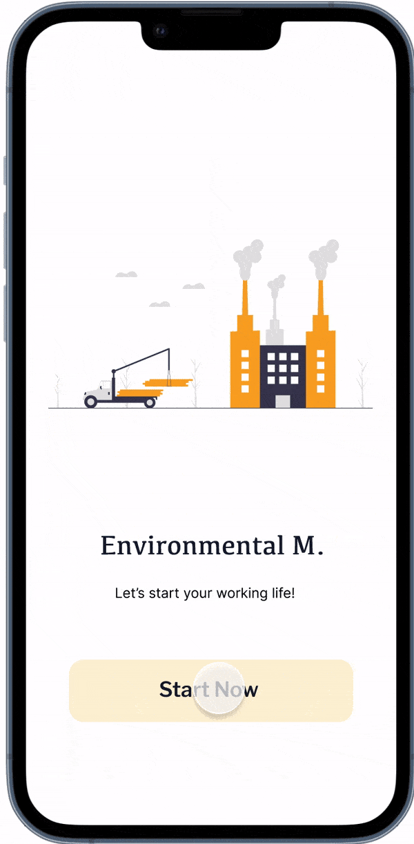
Provided users with clear app usage information and allowed them to choose their role (manager or worker) when logging in.


Process
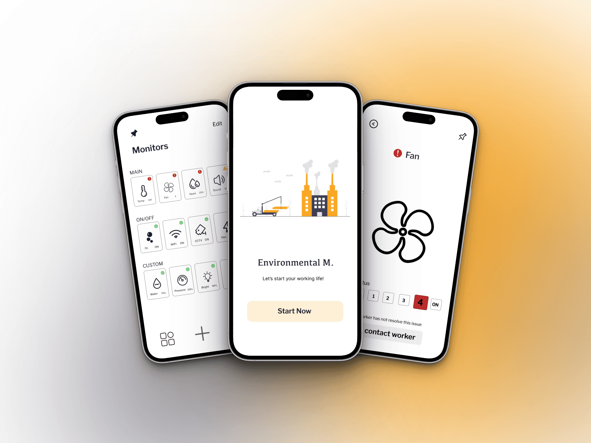
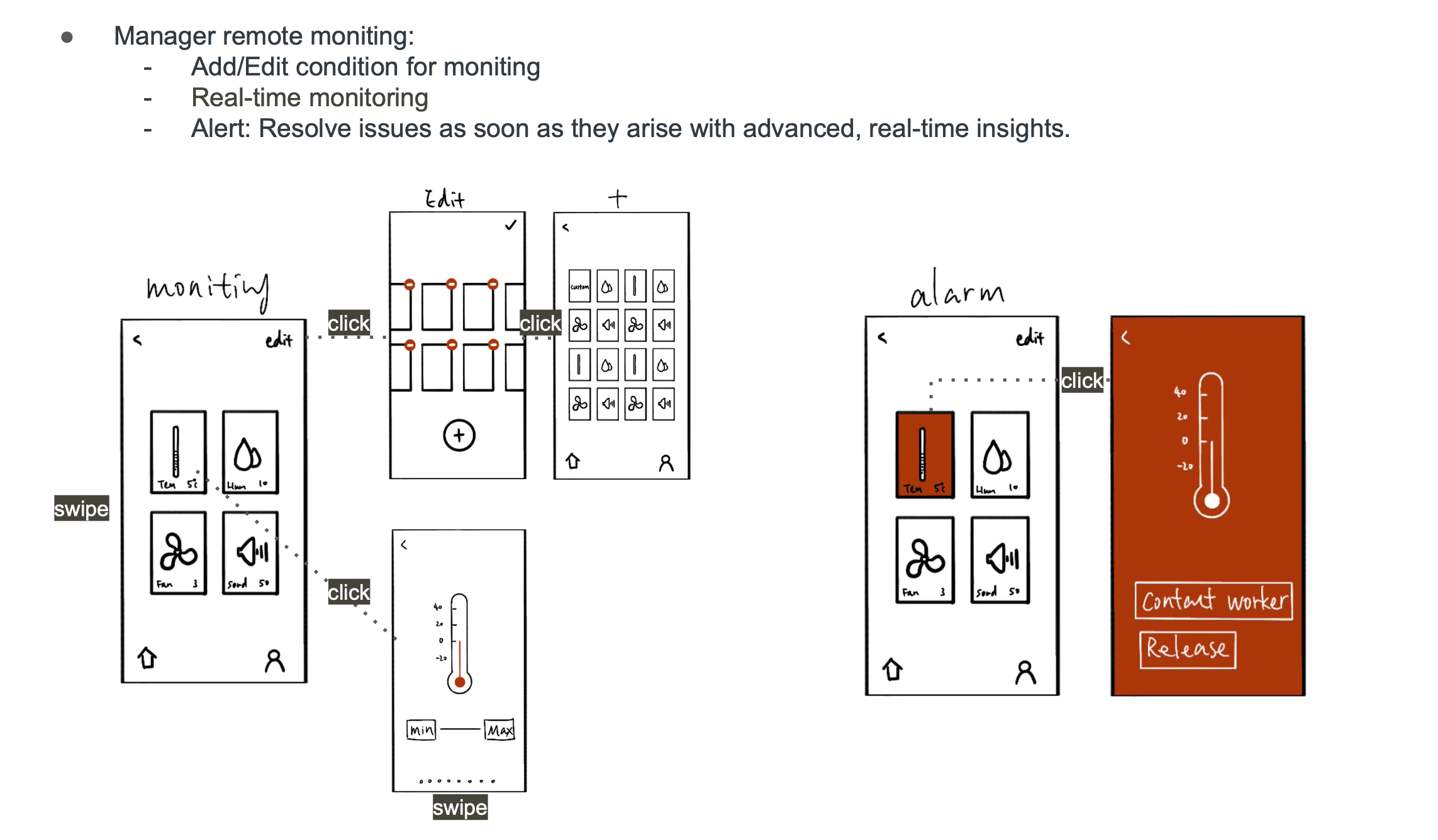
Manager can quickly view warehouse data through this page and make adjustments directly from their phone if any anomalies are detected, ensuring efficient monitoring and control.
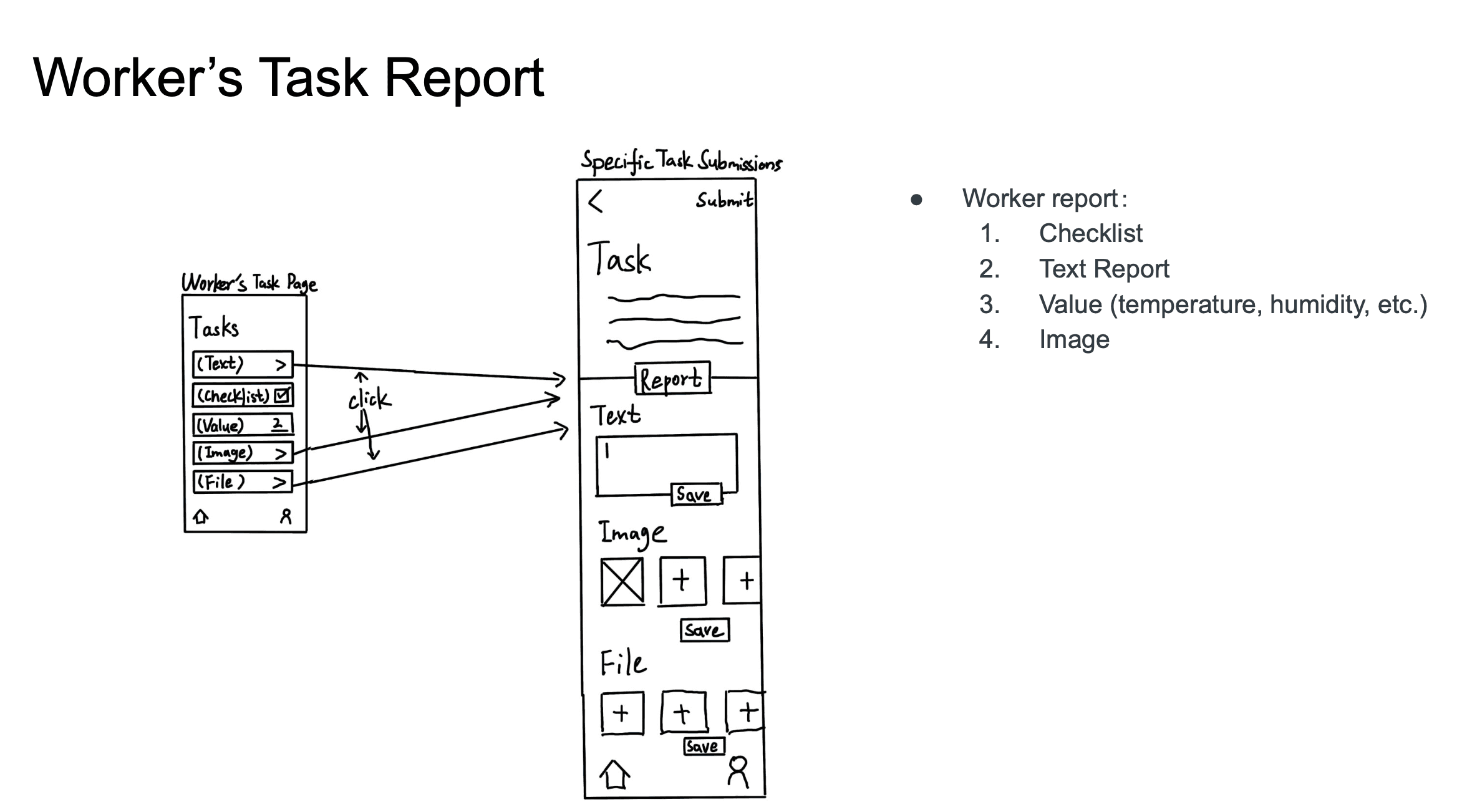
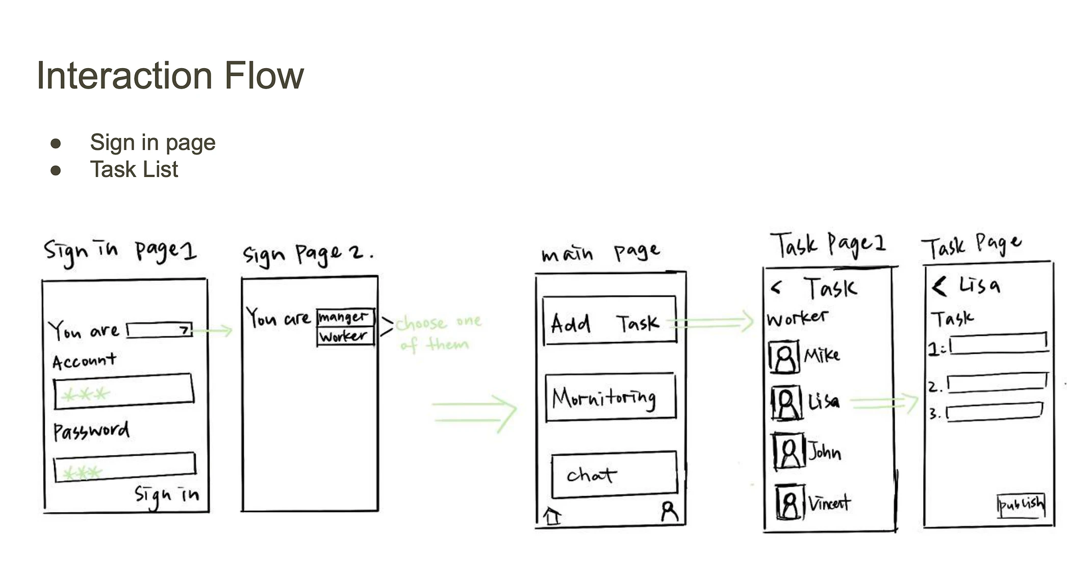
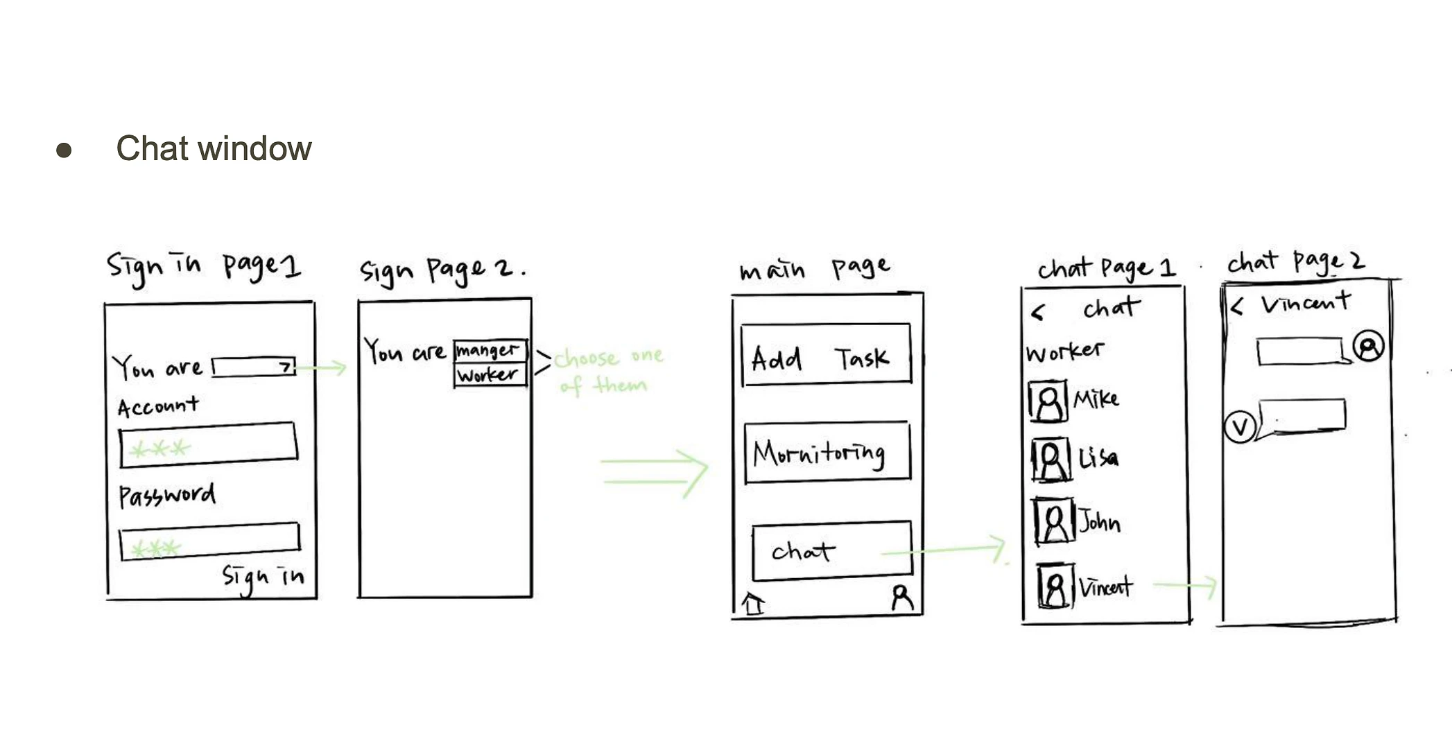
Workers can quickly view tasks assigned by the manager on this page and communicate any issues by sending images, voice notes, or text messages, allowing for timely and efficient collaboration with the manager.
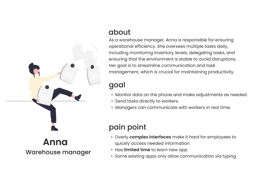
After deciding to focus our design on warehouse managers and workers, my team and I conducted interviews to better understand their real-life pain points. This allowed us to identify key issues and create more effective solutions. Based on our findings, we developed two personas to guide and refine the design process.
After defining the personas, my teammate and I quickly created a low-fidelity sketch on the iPad to help streamline the design process and guide our next steps.
After completing the low-fidelity sketch, I took responsibility for the manager section, while my teammates handled the worker section. Our team used Figma to develop a wireframe, building on the logic from the lo-fi sketch to create the final prototype.
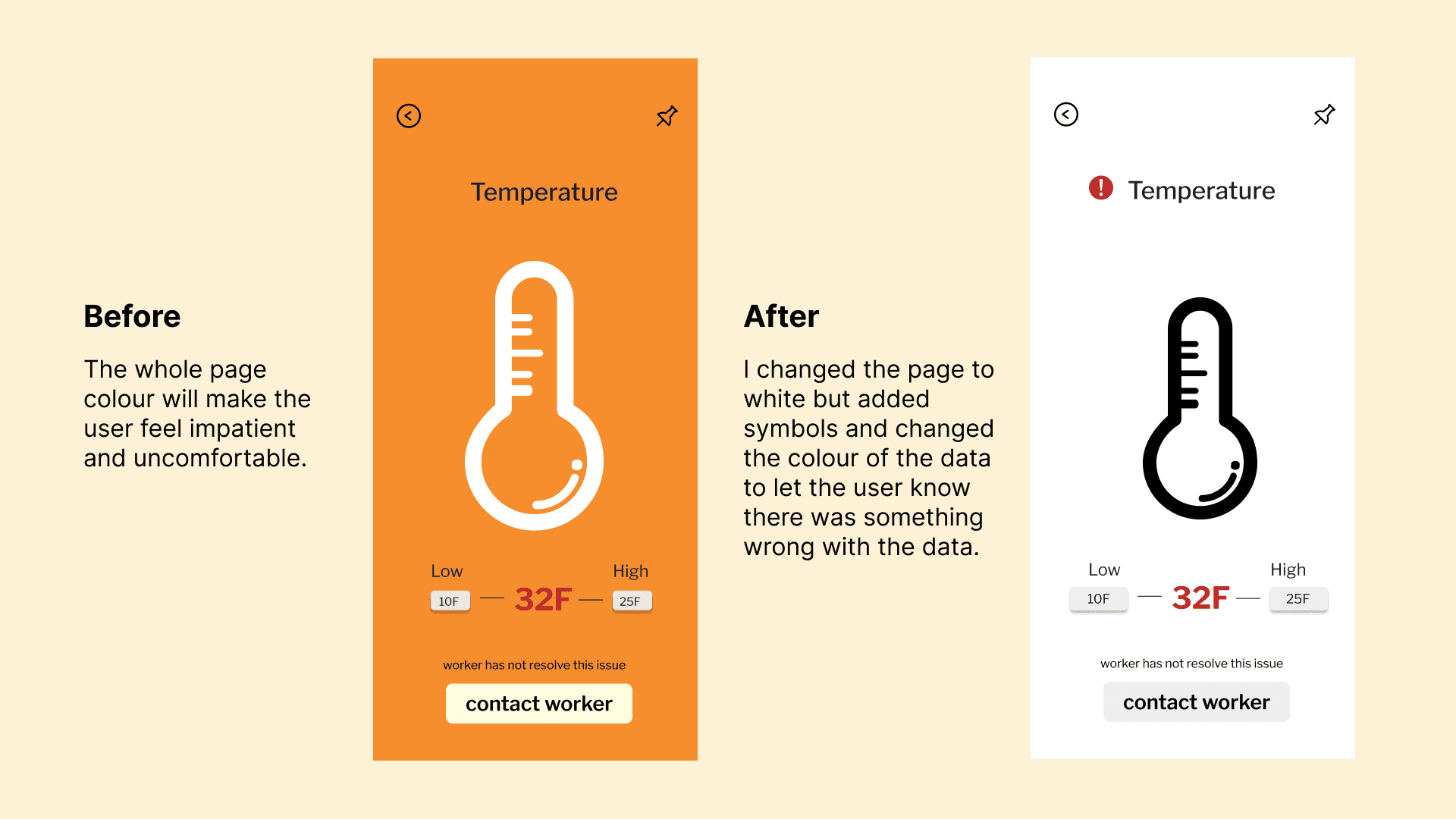
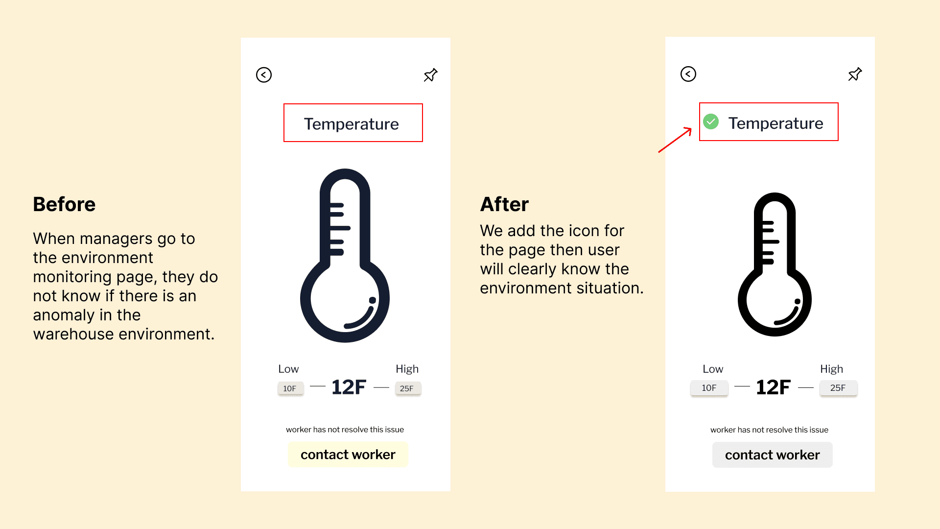
Based on feedback from two rounds of usability testing with 6 participants, our team implemented the following changes to improve the design and user experience.
The final prototype video is here! 👇
For this case study, I chose moderately saturated colors as the primary palette to create a calm and balanced experience, ensuring users feel comfortable while using the app at work.
This was my first full UX design project, and I encountered challenges I hadn’t faced before. Throughout this project, I learned several key lessons:
Defining the project scope is essential. At the beginning of our process, our team struggled to define the project’s scope, which resulted in wasted time when selecting clients. Establishing a clear scope at the outset is crucial, as it saves time and ensures a focused design process.
Communication is key. As a team, we had never completed a UX design case before, making it a challenging task. Initially, we found it difficult to communicate our ideas openly and effectively. However, as the project progressed, we learned how to better collaborate and share our thoughts with each other.
User needs should always drive the design. Throughout the project, we conducted several rounds of usability testing, from the initial concept to the final prototype. These insights allowed us to refine the app and create a better user experience, aligning with the core goal of UX design: to serve users effectively.
These experiences have shaped my approach as a UX designer and underscored the importance of scope, communication, and user-centered design.
Low-Fidelity Wireframe
Medium-Fidelity Wireframe
Usability Test
Final Prototype
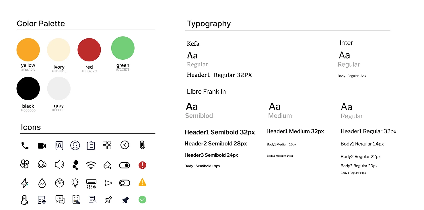
Style Guide
Conclusion+ Reflection
High-Fidelity Prototype Overview
Onboarding page
Features page (manager)
Features page (worker)


Low- Fidelity Wireframe
After defining the personas, my teammate and I quickly created a low-fidelity sketch on the iPad to help streamline the design process and guide our next steps.
Logo
Logo
Logo
Logo
What is Framer?
Framer is a web builder for creative pros. Be sure to check out framer.com to learn more.
Is it easy to learn?
Framer is the fastest tool to build sites with, because you can ship your design immediately, instead of having to rebuild your design in code or a second tool.
Do I need to code?
Framer is an end to end tool that lets everyone design and ship web sites. You don’t need a frontend team or web programming course. Just basic canvas skills.
© Framer Inc. 2023